P² quantile estimator: estimating the median without storing values
Update: the estimator accuracy could be improved using a bunch of patches.
Imagine that you are implementing performance telemetry in your application. There is an operation that is executed millions of times, and you want to get its “average” duration. It’s not a good idea to use the arithmetic mean because the obtained value can be easily spoiled by outliers. It’s much better to use the median which is one of the most robust ways to describe the average.
The straightforward median estimation approach requires storing all the values. In our case, it’s a bad idea to keep all the values because it will significantly increase the memory footprint. Such telemetry is harmful because it may become a new bottleneck instead of monitoring the actual performance.
Another way to get the median value is to use a sequential quantile estimator (also known as an online quantile estimator or a streaming quantile estimator). This is an algorithm that allows calculating the median value (or any other quantile value) using a fixed amount of memory. Of course, it provides only an approximation of the real median value, but it’s usually enough for typical telemetry use cases.
In this post, I will show one of the simplest sequential quantile estimators that is called the P² quantile estimator (or the Piecewise-Parabolic quantile estimator).
Read morePlain-text summary notation for multimodal distributions
Let’s say you collected a lot of data and want to explore the underlying distributions of collected samples. If you have only a few distributions, the best way to do that is to look at the density plots (expressed via histograms, kernel density estimations, or quantile-respectful density estimations). However, it’s not always possible.
Suppose you have to process dozens, hundreds, or even thousands of distributions. In that case, it may be extremely time-consuming to manually check visualizations of each distribution. If you analyze distributions from the command line or send notifications about suspicious samples, it may be impossible to embed images in the reports. In these cases, there is a need to present a distribution using plain text.
One way to do that is plain text histograms. Unfortunately, this kind of visualization may occupy o lot of space. In complicated cases, you may need 20 or 30 lines per a single distribution.
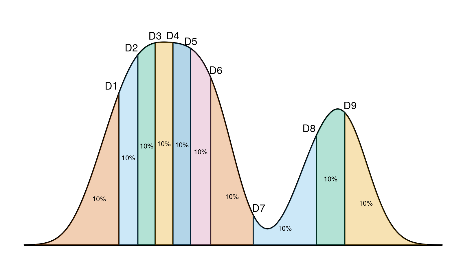
Another way is to present classic summary statistics like mean or median, standard deviation or median absolute deviation, quantiles, skewness, and kurtosis. There is another problem here: without experience, it’s hard to reconstruct the true distribution shape based on these values. Even if you are an experienced researcher, the statistical metrics may become misleading in the case of multimodal distributions. Multimodality is one of the most severe challenges in distribution analysis because it distorts basic summary statistics. It’s important to not only find such distribution but also have a way to present brief information about multimodality effects.
So, how can we condense the underlying distribution shape of a given sample to a short text line? I didn’t manage to find an approach that works fine in my cases, so I came up with my own notation. Most of the interpretation problems in my experiments arise from multimodality and outliers, so I decided to focus on these two things and specifically highlight them. Let’s consider this plot:


I suggest describing it like this:
{1.00, 2.00} + [7.16; 13.12]_100 + {19.00} + [27.69; 32.34]_100 + {37.00..39.00}_3
Let me explain the suggested notation in detail.
Read moreIntermodal outliers
Outlier analysis is a typical step in distribution exploration. Usually, we work with the “lower outliers” (extremely low values) and the “upper outliers” (extremely high values). However, outliers are not always extreme values. In the general case, an outlier is a value that significantly differs from other values in the same sample. In the case of multimodal distribution, we can also consider outliers in the middle of the distribution. Let’s call such outliers that we found between modes the “intermodal outliers.”


Look at the above density plot. It’s a bimodal distribution that is formed as a combination of two unimodal distributions. Each of the unimodal distributions may have its own lower and upper outliers. When we merge them, the upper outliers of the first distribution and the lower outliers of the second distribution stop being lower or upper outliers. However, if these values don’t belong to the modes, they still are a subject of interest. In this post, I will show you how to detect such intermodal outliers and how they can be used to form a better distribution description.
Read moreLowland multimodality detection


Multimodality is an essential feature of a distribution, which may create many troubles during automatic analysis. One of the best ways to work with such distributions is to detect all the modes in advance based on the given samples. Unfortunately, this problem is much harder than it looks like.
I tried many different approaches for multimodality detection, but none of them was good enough. During the past several years, my approach of choice was the mvalue-based modal test by Brendan Gregg. It works nicely in simple cases, but I was constantly stumbling over noisy samples where this algorithm doesn’t produce reliable results. Also, it has some limitations that make it inapplicable to some corner cases.
So, I needed a better approach. Here are my main requirements:
- It should detect the exact mode locations and ranges
- It should provide reliable results even on noisy samples
- It should be able to detect multimodality even when some modes are extremely close to each other
- It should work out of the box without tricky parameter tuning for each specific distribution
I failed to find such an algorithm anywhere, so I came up with my own! The current working title is “the lowland multimodality detector.” It takes an estimation of the probability density function (PDF) and tries to find “lowlands” (areas that are much lower than neighboring peaks). Next, it splits the plot by these lowlands and detects modes between them. For the PDF estimation, it uses the quantile-respectful density estimation based on the Harrell-Davis quantile estimator (QRDE-HD) (see also harrell1982) Let me explain how it works in detail.
Read moreQuantile-respectful density estimation based on the Harrell-Davis quantile estimator
The idea of this post was born when I was working on a presentation for my recent DotNext talk. It had a slide with a density plot like this:
Here we can see a density plot based on a sample with highlighted decile locations that split the plot into 10 equal parts. Before the conference, I have been reviewed by @VladimirSitnikv. He raised a reasonable concern: it doesn’t look like all the density plot segments are equal and contain exactly 10% of the whole plot. And he was right!
However, I didn’t make any miscalculations. I generated a real sample with 61 elements. Next, I build a density plot with the kernel density estimation (KDE) using the Sheather & Jones method and the normal kernel. Next, I calculated decile values using the Harrell-Davis quantile estimator. Although both the density plot and the decile values are calculated correctly and consistent with the sample, they are not consistent with each other! Indeed, such a density plot is just an estimation of the underlying distribution. It has its own decile values, which are not equal to the sample decile values regardless of the used quantile estimator. This problem is common for different kinds of visualization that presents density and quantiles at the same time (e.g., violin plots)
It leads us to a question: how should we present the shape of our data together with quantile values without confusing inconsistency in the final image? Today I will present a good solution: we should use the quantile-respectful density estimation based on the Harrell-Davis quantile estimator! I know the title is a bit long, but it’s not so complicated as it sounds. In this post, I will show how to build such plots. Also I will compare them to the classic histograms and kernel density estimations. As a bonus, I will demonstrate how awesome these plots are for multimodality detection.
Read moreMisleading histograms
Below you see two histograms. What could you say about them?


Most likely, you say that the first histogram is based on a uniform distribution, and the second one is based on a multimodal distribution with four modes. Although this is not obvious from the plots, both histograms are based on the same sample:
20.13, 19.94, 20.03, 20.06, 20.04, 19.98, 20.15, 19.99, 20.20, 19.99, 20.13, 20.22, 19.86, 19.97, 19.98, 20.06,
29.97, 29.73, 29.75, 30.13, 29.96, 29.82, 29.98, 30.12, 30.18, 29.95, 29.97, 29.82, 30.04, 29.93, 30.04, 30.07,
40.10, 39.93, 40.05, 39.82, 39.92, 39.91, 39.75, 40.00, 40.02, 39.96, 40.07, 39.92, 39.86, 40.04, 39.91, 40.14,
49.95, 50.06, 50.03, 49.92, 50.15, 50.06, 50.00, 50.02, 50.06, 50.00, 49.70, 50.02, 49.96, 50.01, 50.05, 50.13
Thus, the only difference between histograms is the offset!
Visualization is a simple way to understand the shape of your data. Unfortunately, this way may easily become a slippery slope. In the previous post, I have shown how density plots may deceive you when the bandwidth is poorly chosen. Today, we talk about histograms and why you can’t trust them in the general case.
Read moreThe importance of kernel density estimation bandwidth
Below see two kernel density estimations. What could you say about them?


Most likely, you say that the first plot is based on a uniform distribution, and the second one is based on a multimodal distribution with four modes. Although this is not obvious from the plots, both density plots are based on the same sample:
21.370, 19.435, 20.363, 20.632, 20.404, 19.893, 21.511, 19.905, 22.018, 19.93,
31.304, 32.286, 28.611, 29.721, 29.866, 30.635, 29.715, 27.343, 27.559, 31.32,
39.693, 38.218, 39.828, 41.214, 41.895, 39.569, 39.742, 38.236, 40.460, 39.36,
50.455, 50.704, 51.035, 49.391, 50.504, 48.282, 49.215, 49.149, 47.585, 50.03
The only difference between plots is in bandwidth selection!
Bandwidth selection is crucial when you are trying to visualize your distributions. Unfortunately, most people just call a regular function to build a density plot and don’t think about how the bandwidth will be chosen. As a result, the plot may present data in the wrong way, which may lead to incorrect conclusions. Let’s discuss bandwidth selection in detail and figure out how to improve the correctness of your density plots. In this post, we will cover the following topics:
- Kernel density estimation
- How bandwidth selection affects plot smoothness
- Which bandwidth selectors can we use
- Which bandwidth selectors should we use
- Insidious default bandwidth selectors in statistical packages
The median absolute deviation value of the Gumbel distribution
The Gumbel distribution is not only a useful model in the extreme value theory, but it’s also a nice example of a slightly right-skewed distribution (skewness $\approx 1.14$). Here is its density plot:

In some of my statistical experiments, I like to use the Gumbel distribution as a sample generator for hypothesis checking or unit tests.
I also prefer the median absolute deviation (MAD) over the standard deviation as a measure of dispersion because it’s more robust in the case of non-parametric distributions.
Numerical hypothesis verification often requires the exact value of the median absolute deviation of the original distribution.
I didn’t find this value in the reference tables, so I decided to do another exercise and derive it myself.
In this post, you will find a short derivation and the result (spoiler: the exact value is 0.767049251325708 * β).
The general approach of the MAD derivation is common for most distributions, so it can be easily reused.